The Marketplace @ Violets & Sunshine

Showing posts with label new products. Show all posts

07 August 2015

Kraft-y Hearts' Friday Focus: Zoe


Hi All! The Kraft-y Hearts have decided to do something new this month! We are inaugurating a new blog share called Friday Focus that will highlight a different Close To My Heart paper collection each month. The Friday Focus will take place on the first Friday of each month beginning today!

Our focus for this month is on the Zoe Collection:


To showcase this fun collection, I used it to create an album for my daughter to take to camp with her this year. However, in creating the cover, I used a couple of stamp sets that aren't available to the public until September 1st. So I'm afraid you will have to wait to see the full cover until then (I'll show it when I showcase my son's album, which also incorporates new stamps that you're sure to love.) So with that, let's take a look at the album!

For the album itself, I used Close To My Heart's Hip Pics Album. This mini album sports a craft cover with white spiral-bound pages, and is ready for you to alter with your own papers and media. I chose to decorate the cover in layers of Glacier cardstock and Zoe polka-dot paper. Now while I can't show you the whole front cover, I did want to give you a look at a cluster I created in the bottom left corner using elements from Zoe assortment and complements, along with thin washi tape from the Carnival (yellow) and Boardwalk (green) packs. I used a little dimensional adhesive for layering as well.


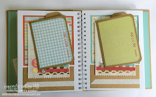
Now let's take a look at the inside. The pages of the Hip Pics Albums mimic the old Polaroid picture frames. They are open at the top so that you can slide a 4x6 photo into the frame. I decided to use Smoothie and Glacier cardstocks instead of pictures to slide into the frames and then matted the opening with Zoe paper. I then added a piece of Kraft cardstock to the bottom of the page along with embellishments. Below is the first page, where I added a scripture verse I printed on my inkjet printer, and embellished the page with stickers from the Zoe complements pack:


The albums I make for the kids each year are designed for camp photos, but they also house notes from me and their dad along with "coupons" that they can redeem throughout the year for things like extra screen time, getting out of a chore or laundry duty, choosing a family outing, and that sort of thing. So the rest of the pages have little treat bags serving as pockets and folders that I created using my We R Memory Keepers Envelope Punch Board. Each folder is made from Kraft cardstock and is matted on the front with Zoe paper. The pockets are embellished with Gold Polka-Dot washi tape along with more thin washi tapes from the Carnival and Boardwalk packs. I also added stickers from the Zoe complements pack and a little Coral Shimmer Trim for bling.


 Below you can see where I added White Shimmer Trim for a little change up:


And here is a look at the folders (which hold notes and coupons inside). I added the date to each folder in Smoothie ink using my Dear Lizzie Date Stamp by American Crafts:


And that's it! My daughter is gone for 14 days, so there are 14 pockets total. The book has 8 pages so I used the back page to attach a little bit of paper so that she could write down contact information for her friends. (Campers cannot bring electronics to camp with them including cell phones, so she has to write it down! Kinda love that!)

I hope you enjoyed this look at Zoe. It's a fun and fabulous collection! Now, head on over to Lynn's blog, From My Bungalow, and see what inspiration goodness she has for you today!


10 August 2014

A Little Weekend Mojo

Hi folks! Just thought I'd share a little birthday card that I made for my niece. The design was inspired by this week's Mojo Monday sketch:


Here's my take on the sketch:


The base of the card is White Daisy cardstock cut at 51/2 x 8 1/2 inches and scored and folded at 4 1/4 inches. I layered that with Canary cardstock from the new Paper Fundamentals Whimsy Assortment. The patterned paper is from the new Brushed Paper Pack. For the ribbon, I layered some of the new Thistle Diagonal Striped Ribbon onto some retired seam binding. I added a sentiment from the Happy Birds stamp set in Black Exclusive Ink. The butterflies, "Happy Birthday" and the interior sentiment are from the Your Own Kind Of Wonderful stamp set and are stamped in Thistle Exclusive Ink. The large butterfly, sentiment flag and the card front are popped up using Close To My Heart's new Thin 3-D Foam Tape. (Love it! It's about 1/16 of an inch think so it gives a bit of dimension without making the card too thick.) The butterflies were fussy cut and adhered to the card with foam tape (the big one) and glue dots. For the smaller butterflies, I added antennae with a thin black marker. (It was too difficult to cut around the tiny antennae on the stamp!) I then added bitty sparkles and clear assorted sparkles for a little bling.
Here are a couple of close-ups:
And here is the sentiment from the inside:
And now for one more view of the card:

Hope you enjoyed this bright little card. Have a great rest of the weekend! (I'm picking up my kids today from camp. They've been gone for two weeks. Can't wait to see them!)


17 August 2012

Wild West or Little House on The Prairie...

I just can't decide which better encapsulates the new Clementine collection. Where Dakota evokes images of dusty rodeos, Clementine has more of a quilt and bonnet feel. In fact the quilt is the inspiration behind today's card.


The card base is a standard A2 cut from Pacifica cardstocked and inked around the edges with a little desert sand.

The quilt blocks are cut at 1 1/2, 1 1/4, and 1-inch, and inked with a little desert sand as well. The centers of the blocks are buttons from our Basic Assortment with 5mm light tan opaques in the center from the Mocha collection.


The sentiment is from...you guessed it..."It's Your Day" and stamped in desert sand ink on Colonial White cardstock. (This set is so versatile, you really don't want to miss it!) I mounted the sentiment on a small piece of patterned paper, added some 4mm light tan opaques, and popped it up with foam tape.

I cut a piece of paper 6-inches by a 1/2-inch and folded it to mimic ribbon for a little extra visual interest, and added a couple of 2 1/2mm opaques to tie it all together.

So I don't know if this collection is more Laura Ingalls or Annie Oakley, but whichever it is, it's beautiful. To see it all, click here.


- Posted using BlogPress from my iPad

15 August 2012

Truly Amazing

The wild west is back! Yep it's time to dig out those prairie skirts circa 1981, grab your Stetson and get crafting! Close To My Heart has released two new western-themed paper collections. Today's card features the Dakota collection.


This collection includes weathered wood grains, bandana paisley prints, stripes, and houndstooth in stunning rich reds and blues.

For the main sentiment, I used stamps from the April 2012 Stamp Of The Month. The background and "You Are Truly" banner are stamped in slate ink (the background is a second generation stamping). "Amazing" is from the same stamp set and is double-stamped in barn red. All the stamping was done on Colonial White cardstock. I mounted "Amazing" on a banner made from the blue bandana paper and popped it up with foam tape.
Here's a close-up:


The second sentiment, "true story," is stamped on Colonial White cardstock in sky blue ink. I then double matted it on two pattern papers and added a couple of antiqued copper brads for a little flair. The stamp is from the "It's Your Day" double stamp set.
Here's a close-up:


Hope you enjoyed a quick look at Dakota. Now put on your happy boots and get out there and create somethin'! (Just so you know, I'm resisting adding y'all at the end....)


Posted using BlogPress from my iPad

13 August 2012

A Little Flirty

When I first saw our new Flirty collection, I thought, "Hmmm. Nice, but not me." But when I had the actual papers in front of me, I was hooked. This collection has all the richness of fall colors, but with lovely versatile patterns.


The card base is a standard A2 in Kraft cardstock. Though it doesn't come through that well in the photos, I stamped the card base using the large flower from the "Card Word Puzzle" set in desert sand ink using the second generation stamping technique to give a subtle texture. The accent cardstock and the ink used for the sentiment are both Outdoor Denim. The sentiment is from the "A Little Thanks" stamp set. I added some mocha opaques for a little bling, though silver brads or clear sparkles would also be a nice touch.

Here's a close up of the sentiment:


If you look carefully you can see a little bit of background stamping on the base. The sentiment is stamped on White Daisy cardstock and popped up with foam tape.

Hope you enjoyed! You can check out the entire Flirty collection here.


Posted using BlogPress from my iPad

12 August 2012

One More from the Avonlea Collection

Here is one more example of the beauty of Avonlea.


Honestly, this might be my favorite line of all. Then again, it's really too hard to choose! For this card, I took a more formal approach. Again, it's a standard A2 (4 1/4 x 5 1/2) card base cut from Colonial White cardstock. I used our NEW Exclusive Inks slate ink for the sentiment.

The flower was inspired by an example shown in the new Idea Book on page 49. (Kids, this book is so much more than a catalog!) I think it's a great example of "beautiful whimsy."

The petals on the flower are made from a series of hearts that have been folded in half and adhered to a small circle using glue dots. (Liquid glass would also work well.) The button in the middle is from the Bohemian Assortment embellishment collection. I decided that I wanted the matching thread look, so I cut a sliver of Avonlea teal cardstock and threaded it through the button holes. I then attached the button and "thread" to the middle of the flower. Simple but elegant.

Here is a close-up:


I hope this inspires you to go make some beautiful whimsy of your own!


Posted using BlogPress from my iPad

09 August 2012

Avonlea meets the Hexagon Trend

My friend Lynn and I are exchanging cards so that we have more creative examples from the new Close To My Heart lines to share with you. I thought I would post some of the cards I made over the next few days just to give you an idea of how beautiful and versatile the new lines really are.


With today's card, I used paper from the Avonlea B&T paper pack and a long-retired hexagon punch. The hexagon shapes allowed me to showcase all the beautiful patterns and colors this paper pack has to offer. Aren't they gorgeous? (A simple, but effective design!)

The green and teal cardstocks are unique to the Avonlea collection. However, our Exclusive inks in olive (used here), desert sand and chocolate (both used on the Avonlea layout posted here) work well with this entire collection including the unique color-trend colors.


Here is a close-up of the sentiment stamped in olive ink. The background is second generation stamping using a stamp from the Avonlea Workshop On The Go exclusive set. "Hi!" is from the "It's Your Day" double stamp set that will be available between 15 August and 30 September in celebration of National Stamping Month. ("It's Your Day" can be purchased for $5 with any $35 order during that time period!)

The base of the card is a standard 5 1/2-inches by 4 1/4-inches, and was cut from a 12x12 sheet of our Kraft cardstock. The sentiment is stamped on colonial white cardstock, and popped up slightly using glue dots.

I hope you enjoyed! Feel free to post any questions or comments. If you want to take a look at Avonlea, just click on "Shop With Me" to the right.


Posted using BlogPress from my iPad

27 July 2012

A Layout from Avonlea

I wanted to share a layout I did from the new Avonlea Workshop On The Go. This kit has an amazing amount of supplies in it. Over the next few days, I'll be posting all the projects I was able to do with it. The layout shown here is the main layout for the kit.


Because I'm new to this, I didn't have all the recommended ink colors or alphabet stamps. Rather than ordering those, I wanted to see what I could do with what I had. I think it worked out pretty well.

Here are the pages separately:


I used desert sand ink for the title and a mixture of desert sand and chocolate  for "so happy together." The kit instructions calls for olive and chocolate inks on the stamped images, but I substituted desert sand for olive, and really liked the effect. The alphabet set that is used in the kit example was the keepsake alphabet. I don't have that set yet, so I substituted the glamour lowercase alphabet.

One of the things I really enjoyed about using this kit was the multiple stamping techniques it employs, such as reverse and second generation stamping. You can see both techniques here:


These stamps were reversed (that is the side that usually clings to the acrylic block was used as the image and then stamped to the page on the second generation (that is after the ink has been stamped of once on a scrap page). I then cleaned the stamp and placed it back on the block in its with the reverse side down as usual and stamped over the reversed image. It softens the image a bit, I think.

The kit comes with a package of opaque mocha adhesive gems that look gorgeous scattered across the page randomly.  The stamped images and "so happy together" are part of the exclusive stamp set that also comes with the workshop. Four of the images coordinate with the new Artiste cartridge as well.

I also enjoyed using the parlor velvet rub-ons. I had never used them before and I think they add a nice touch to the layout.


The slate gray is a little light for the base cardstock, so the instructions suggest outlining the rub-ons in chocolate ink. It really does give them extra pop.

I substituted desert sand in for the chocolate in called for in the title. In order to make it stand out a little more, I gave the stamp a shadow. (I'm sure the technique has a name, but I can't seem to find it.)


I stamped the each word directly to the page and then did a second generation stamp a little below and to the right of it. (That's the nice thing about clear stamps. You can do techniques like this because you can see through the stamp for placement. It's much harder to do with rubber stamps, though not impossible.)

So what do you think?

I hope you enjoyed this, and are inspired to get out there and get those pictures on some pages for everyone to see!